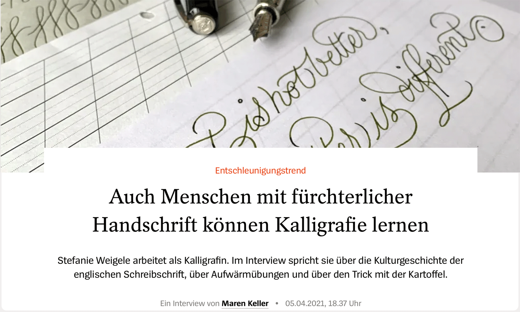
Drills, details and patience – an interview in Spiegel Online
In March 2021 (in that second Spring that would become another tough year of the pandemic), I was delighted to be asked for an interview by Spiegel Online (one of the major German weeklies)! Obviously it was mainly about calligraphy and my very personal approach to it, a bit about history, drills, potatoes and my book. You can read the questions and answers here. In case you don’t read German, just go on: I've translated the interview and maybe you’ll find something interesting for you there.
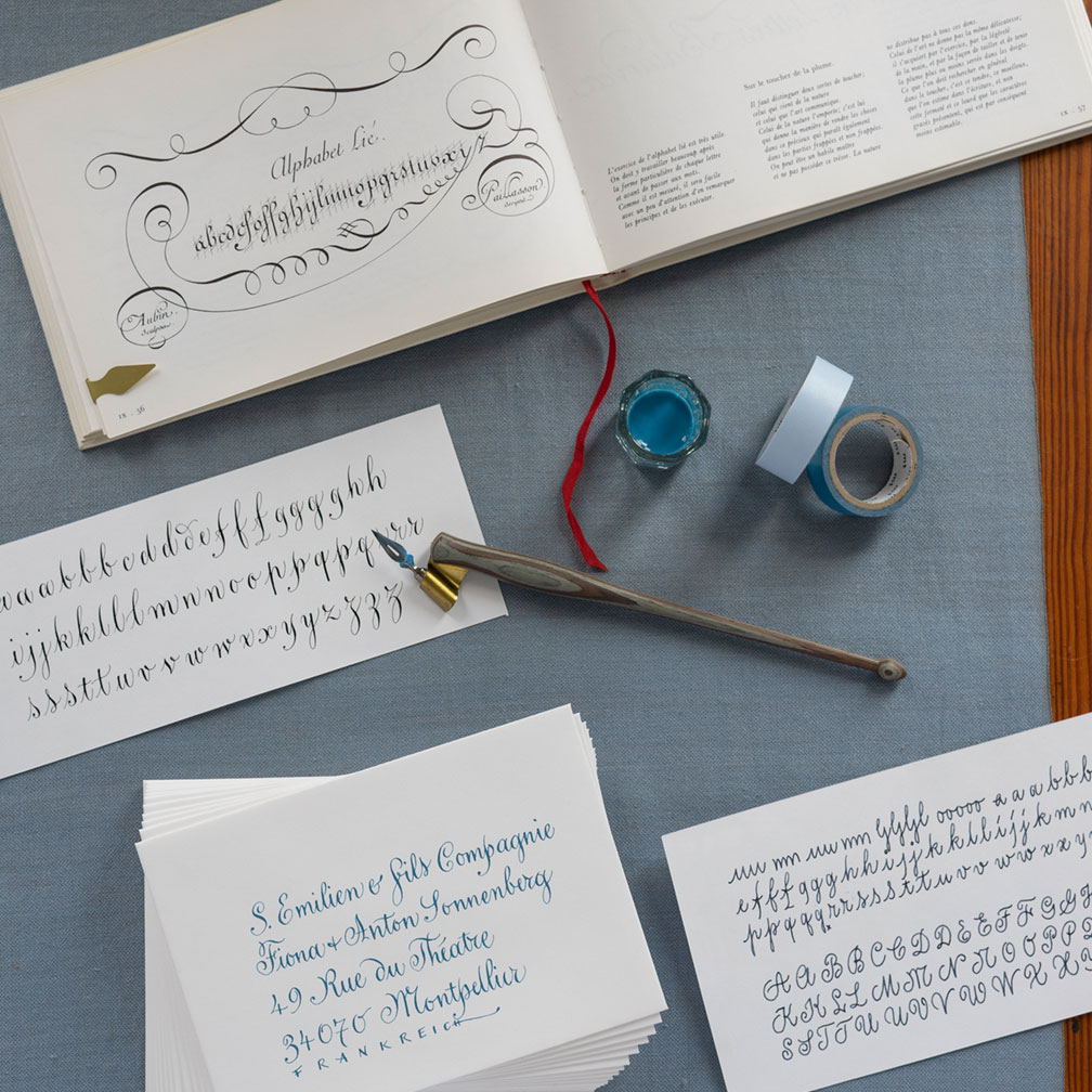
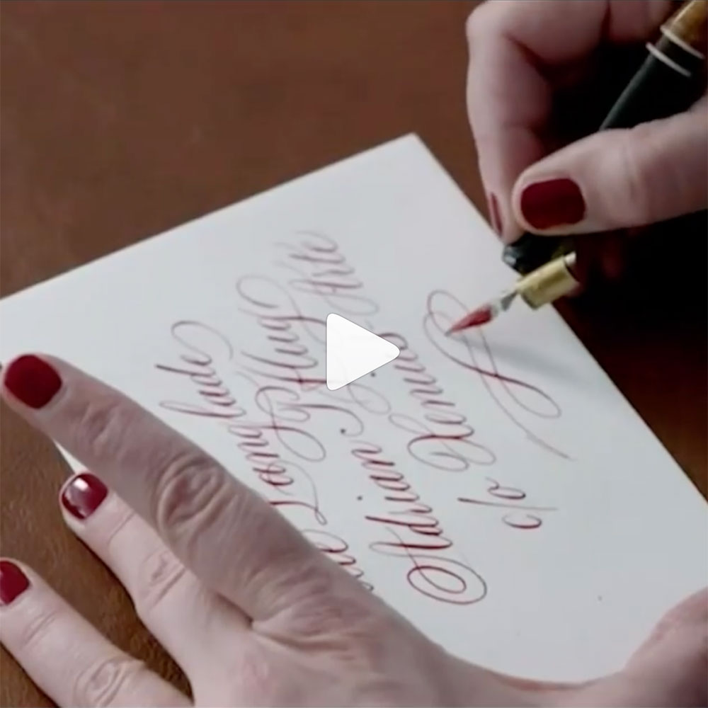
Copperplate calligraphy can also be interpreted with everyday writing instruments such as a fountain pen.
Full text of the interview
Ms Weigele, as a calligrapher, do you have a favourite letter? :: That’s actually not so easy for me to decide because letters can look very different depending on which script (or font) you use. A lowercase ‘a’ in English cursive has a very distinct shape with seemingly no or very few relation to a lowercase ‘a’ in Fraktur. I find the German ‘sharp ß’ charming because it has something archaic about it. I love trying out different variations of this ligature that work well in Copperplate (or English Roundhand) – because the ‘ß’ doesn’t actually exist in other languages than German.
In recent years, there has been something of a hype around calligraphy; many people have discovered calligraphy as a hobby for themselves. What do you think is so fascinating about this for people? :: I think that has a lot to do with the feeling of slowing down. If you want to learn calligraphy, you have to consciously concentrate on formal details and take your time and rest. If you write too quickly, especially at the beginning, it simply doesn’t work. For me, however, there is something else that is great about it.
What exactly is that? :: I am incredibly fascinated by how such a variety of forms could emerge from the originally quite simple elements of the Greek alphabet via Latin. And that the entire history of culture can be found in the history of writing. Because writing always has something to do with the time and place of its origin. Many of the scripts that we still use today in classic European calligraphy already existed in the Middle Ages, when a quite strict distinction was made between everyday writing and book scripts (or hands). Books were actually written by hand with these specialized book script styles back then, and they were incredibly valuable. A scribe would spend several years working on a Bible. These were often nuns or monks, and later also lay people. Traditionally trained calligraphers today should master all these alphabets from the Middle Ages and the Renaissance.
And how many different scripts have you mastered? :: That depends on how strictly you differentiate between scripts and what ‘master’ means. I would say I write between five and ten styles - but to varying degrees. My speciality are clearly the so-called pointed pen scripts, which I also like to work with experimentally.
They are called that because they are written with a pointed nib? :: Exactly. When the pointed steel nib was invented in the first half of the 19th century, it was a radical change in writing culture. There are entire treatises from that time that complain about the fact that people can no longer cut goose quills and about the supposedly resulting decline in the art of writing! I probably write most often in Copperplate or English Round Hand, which, by the way, was originally also written with a broad-cut quill. In this respect, I personally don’t find the distinction between pointed and broad pen scripts all that useful, but that’s a topic in itself.
Even a layman can recognise Copperplate by its characteristic flourishes and ornamentation. :: Yes, these sweeping curves and opulent decorations are also what first attracted me to this script. But the great thing about it is actually something completely different: Namely the fact that this style was quite revolutionary at the time it was created – because of its simplicity and legibility! To put it simply, a whole range of Gothic-style scripts were in use in England at the time, but none of them could be written anywhere near as quickly as English cursive. To write an ‘a’ in the very formal script Textura, you have to make up to seven strokes. For an ‘a’ in English Round Hand, only two: an oval and a downstroke stroke that ends in a curve. This was also interesting for economic reasons. At the time, the British Empire was gaining tremendous momentum and started trading with the whole world. It also waged wars and founded colonies – that story also has a dark side. So there was a huge need for documents that could be created quickly and deciphered on the other side of the world. In addition, Round Hand has very narrow basic shapes, which meant that it didn’t take up much space. Paper and parchment were still very expensive back then. So the new English writing style was practical and beautiful.
You wrote a book in which you explain how to learn to write Copperplate. The famous ornate capital letters only come at the very end. Instead, you start with basic strokes. Quite sobering. :: Perhaps you can compare it to learning to play a musical instrument. When you start to play the piano, you don’t immediately improvise with virtuosity. The ornate capital letters look light and natural – but their construction follows rules. So on the one hand, you have to know these rules and memorize the forms of the letters. And secondly, you have to practise sequences of writing movements so that you no longer have to think about how to get from one oval to the next, for example. Otherwise you’ll hesitate in the middle of a stroke and suddenly have a kink in there, and then there'll be no more natural flowing swashes. That’s why these basic stroke exercises are essential – as annoying as some may find them. But I also think you shouldn’t force yourself to do drills for hours on end if it bores you.
So it seems that much more important than flourishes are the lowercase ‘n’ and the lowercase ‘o’. Why are these inconspicuous letters so crucial? :: Because they contain all the major information about the lowercase letters of the script – you can derive many other letters from them. The ‘n’ tells me the width of a standard miniscule, and the ‘o’ defines the form of all ovals and what the negative space and curves look like. Furthermore, both letters show me if it’s an upright or a slanted style.
Can people with terrible handwriting also learn calligraphy? :: Absolutely. Firstly, it’s generally the case that not everyone can become a master at everything. But anyone can enjoy calligraphy. In my experience, you can’t draw any conclusions about a person’s talent for calligraphy from their handwriting. Most people want to write as quickly as possible in everyday life, to make a fast note of something. Many have not learnt a good cursive handwriting exemplar at school (or none at all). And then many people simply rarely write by hand. And if you don’t practise, in most cases you don’t have good fluent handwriting.
Please explain a few things that are somewhat surprising from the outside. For example: As a calligrapher, why do you need a potato on your desk? :: When I dip my nib, the aim is to have a wafer-thin, even film of ink on it. If the nib is only slightly greasy, for example from touching it with your fingers, the ink will initially roll off the nib or sit in a thick drop on its underside. If you start writing and apply pressure to get a thicker stroke, an ugly blob suddenly will fall on the paper instead of a nice, even line. You can prevent this by briefly dipping the nib into the cut surface of a potato – but there are also other methods to help the ink behave!
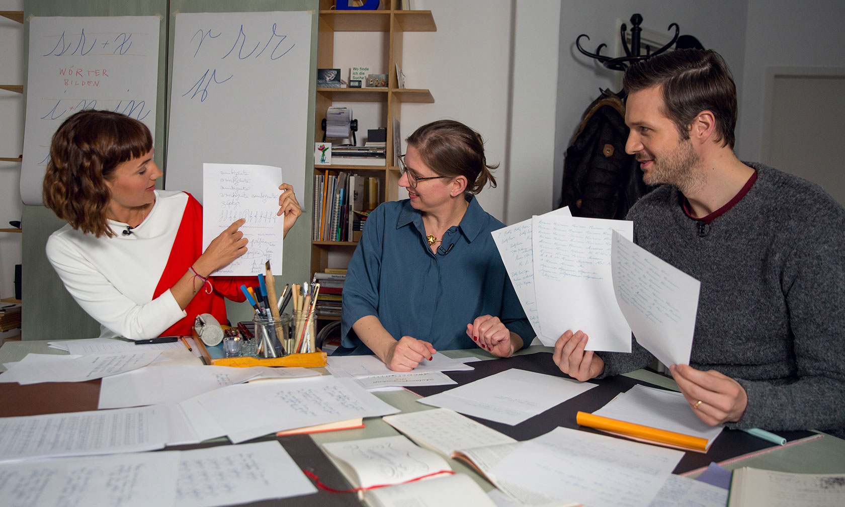
What are the so-called drills all about? :: Drills are abstract preliminary exercises designed to make it easier to write letters and flourishes. For example, you can practise isolated or combined ovals, spirals or downstrokes. Some people find this terribly monotonous. Others feel drills to be almost meditative – like mindfulness exercises.
Why is walnut ink so popular on Instagram? :: On the one hand, walnut ink simply writes very well, but it also has an attractive colour. It’s a nice dark hue, very warm as it’s brown, not black. I think that appeals to the nostalgic feeling that many people associate with calligraphy. In contrast, iron gall ink, which has been the main ink used for documents in Europe since the Middle Ages, is completely grey-black and rather cool.
And last but not least: What is a pangram? :: A pangram is a sentence that contains all the letters of the alphabet, but preferably only once, which is only possible in a few languages. It’s perfect for practising because it forces you to write letters that don’t otherwise occur so frequently. The ‘x’, for example, is quite difficult to write correctly in Copperplate, and because it doesn’t occur so often, it’s tempting to neglect it a little.
Is there a pangram that you particularly like to write? :: There is – it’s: ‘Extraño pan de col y kiwi se quemó bajo fugaz vaho.’
That’s Spanish, isn’t it? And what does it mean? :: Yes, it means: Strange bread of cabbage and kiwi burnt under a vanishing fog.